While full rebrands absolutely have their place, brand evolution is often the smarter move when a brand already has a solid foundation. It is about refining what exists, not replacing it, and making sure the brand is better equipped for where it is headed next.
At Coffee Creative, brand evolution is a considered process. We look at what is working, what could work harder, and how the brand needs to show up going forward, visually, conceptually, and practically.
In branding, growth doesn’t always mean starting from scratch.
What is brand evolution?
Brand evolution is the refinement of an existing brand identity, rather than a complete change. It focuses on improving clarity, balance, usability, and alignment, while keeping the recognisable elements that people already know and trust. The brand does not lose its identity, it simply becomes a more confident and resolved version of itself.
From a logo perspective, this often includes:
- Refining proportions and spacing
- Improving balance and legibility
- Subtly adapting logo typography to make it more unique
- Strengthening the concept behind the logo
- Making sure the logo works better across different applications
Brand evolution vs Rebrand
Both brand evolution and rebranding are valuable. The right approach depends entirely on the situation.A rebrand is often the right choice when a business has fundamentally changed direction, positioning, or audience, and needs a clear reset. A brand evolution works best when the brand already has equity, recognition, and history, but the execution needs refinement. It allows the brand to grow and modernise without losing familiarity or trust.
In short, evolution builds forward, while a rebrand redefines.
Why choose brand evolution?
Respecting brand equity
Many brands have built up recognition and credibility over time. When the foundation is strong, evolution allows that equity to be protected, while improving how the brand shows up visually.
Signalling growth or direction
As a business evolves, its brand often needs to reflect that shift. A refined logo can act as a clear visual marker, signalling progress while creating a definitive reference point that ensures all brand executions align with the new direction. It also makes it easier to clearly distinguish what represents the current brand versus what belongs to the past.
Creating distinctiveness
When a logo is purely a font, it is easy to replicate. Brand evolution allows for subtle adaptations to the logo typography, introducing small, intentional changes that make the logo more distinctive, ownable, and considered.
Strengthening the concept
Sometimes the original logo does not fully capture the brand story, or that story has evolved over time. Refining the logo creates space to better tie it back to the brand’s values, offering, or positioning, without needing to change it entirely.
Improving balance and modernity
As brands grow, design standards shift. Evolution often focuses on cleaning up spacing, proportions, and balance, helping the logo feel more resolved, contemporary, and confident, while still holding up long term.
Making the logo more practical
A logo has to work in the real world. Sometimes the challenge is not how it looks, but where it needs to live.
Brand evolution can improve:
- Scalability
- Versatility across layouts
- How the logo icon and logo typography work together
- Performance across digital, print, signage, apparel, and sponsorship environments
Brand evolution in practice
Creating a lasting impression for your customers often hinges on the details. At Coffee Creative, we understand that the devil is indeed in the details, which is why our turnkey activation solutions are crafted to ensure every aspect of your event is executed to perfection. Whether launching a new product or hosting a major event, we go all in to live and breathe your brand, delivering experiences that resonate with your audience.
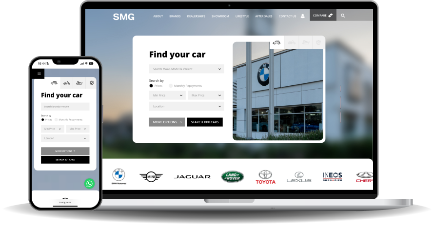
SMG
For SMG, the focus was on refining the logo typography to feel more distinctive and intentional. Subtle adaptations introduced a sense of movement and direction, drawing on ideas of journey, travel, and progress. The evolved logo also created a clear visual shift, making it immediately obvious when the new branding was being used.
Shower Haus
Shower Haus already had a strong base. The evolution focused on cleaning up spacing, alignment, and balance, along with subtle refinements to the logo typography. These changes brought more clarity and consistency to the brand, without losing its original character.
Fourways
The Fourways logo needed better balance and usability. By reducing the scale of the logo icon, the logo typography became the clear priority. This improved legibility and scalability, while the logo icon still communicates the concept, referencing temperature and air conditioning, in a way that supports the overall logo rather than overpowering it.
Fidelity
With Fidelity, practicality played a big role. The original logo was very wide, which made it difficult to use across different formats. Through evolution, the logo was refined into a more compact system with a rounded logo icon, improving balance and making it far more versatile, particularly for applications like sports sponsorship and apparel.
Evolution as a strategic choice
Brand evolution is not about making small changes for the sake of it. It is about intentional refinement. It is a strategic choice for brands that understand who they are, value their history, and want to move forward with clarity. Sometimes the strongest move is not a dramatic change, but a thoughtful evolution that improves how the brand looks, works, and feels everywhere it shows up.
At Coffee Creative, we see brand evolution and rebranding as complementary tools, each used with purpose, depending on what the brand needs next.