The challenge
Air rights are complex. The concept isn’t new, but the way we manage and monetise the air above properties? That’s uncharted territory. AirRegistry came to us with a bold ask: create a brand that brings clarity to an invisible asset, starting with the logo.
Create a brand that brings clarity to an invisible asset
The process
This project wasn’t just about creating a mark, it was about designing a brand identity that could carry new thinking. Air rights are unfamiliar territory for most, so the logo had to do more than just look the part. It needed to spark understanding, inspire confidence, and make space for something new.
01
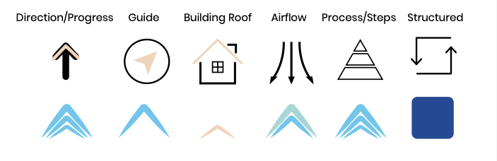
A Symbol That Says It All
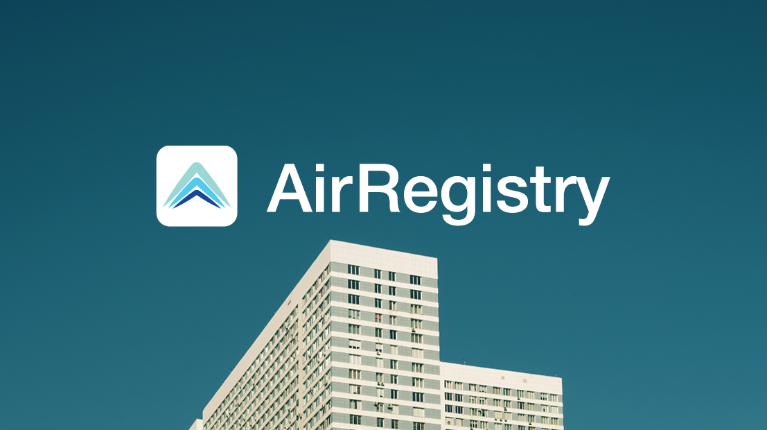
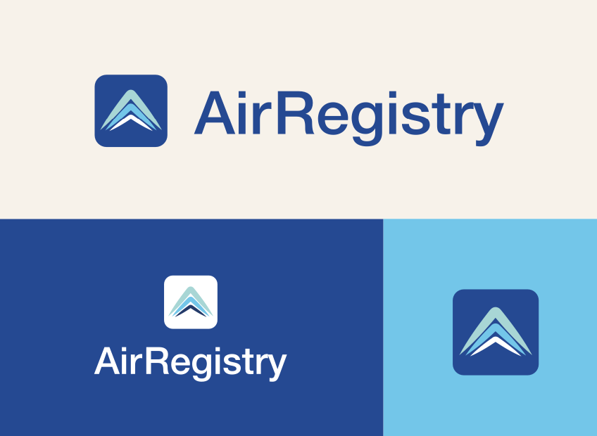
The final icon lives inside the ‘A’, a deliberate choice that makes the logo feel both grounded and expansive. The geometric mark reflects a roofline, directional arrows, and airflow all at once. But more importantly, it feels effortless. A simple shape, designed to hold a complex idea. It’s a nod to structure and elevation, and a visual cue for progress and potential.
02
A Horizon, Not Just a Logo
Colour brought in the emotional layer. A soft gradient from blue to green to peach mimics the quiet optimism of a rising horizon, speaking to growth, calm, and new beginnings. It reflects the kind of future AirRegistry wants to build: innovative, reassuring, and full of possibility.
03
Bold Clarity in Every Detail
From the Helvetica Neue typeface to the intentionally minimal layout, every detail was designed to simplify. The system is clean and contemporary, with enough warmth to stay approachable. It’s confident without being cold, tech-forward but still human. A brand that leads with clarity in a space that often feels anything but.
The direction
AirRegistry now stands as a confident first in a new category, defined by a logo that’s calm, clean, and quietly ambitious. The identity bridges innovation and trust, taking something complex and making it feel simple. It’s a brand that opens up the conversation around air rights and helps people see what’s possible above.
Summary
AirRegistry’s logo does more than represent a business, it introduces a future. From its subtle icon to its sunrise-inspired palette, the brand system is designed to inspire trust and make the invisible feel tangible. A bold idea, grounded in thoughtful design.