Our blog
Get StartedCelebrating Men’s Health Month with a Morning of Padel
At Coffee Creative, we know that building bold brands, websites and campaigns starts with taking car…
SA Home Loans x Breathe Conservation on World Ocean Day
On World Ocean Day, we had the privilege of capturing something truly meaningful: a partnership betw…
A Brand for Better Mental Health – Introducing Medshield Mind
In a world where mental health conversations are no longer optional, we had the opportunity to help …
Celebrating the Reach for a Dream Ladies Breakfast
On Saturday morning, the women of Coffee Creative joined the Reach for a Dream Ladies Breakfast at T…
Behind the Scenes of Our Sixth Shongweni High Goal Polocrosse
For the sixth year, we had the privilege of working alongside the organisers of the Shongweni H…
Numonix Website Redevelopment
Website URL: www.numonix.ioSector: Enterprise Communications / Compliance RecordingPlatform: WordPre…
Sandwiches & Slippers: A Day of Giving Back
At Coffee Creative, we’re big on culture, big on showing up for each other and big for showing up fo…
3 Years of Big Walk Magic with Medshield
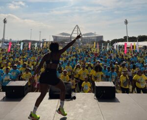
For the third year running, Coffee Creative proudly partnered with Medshield to bring their brand to…

Let’s get started
Let’s bring your vision to life. Fill out the form below, and let’s start the conversation about how we can work together to achieve your goals.


