Learn the key differences between RGB and CMYK colour models, and how each impacts digital and print design for vibrant, accurate results.
When it comes to design, colour is the secret sauce that can take a concept from good to great. It can evoke emotions, set the tone, and guide the viewer’s eye. But, here’s the thing, colours on a screen and colours in print aren’t always the same. To understand why, let’s talk about the two primary colour models you’ll encounter in design: RGB and CMYK. While they might seem similar at first glance, the way they create and display colours is night and day. Understanding these differences can make or break your next project, whether you’re designing for digital platforms or preparing materials for print.
The RGB colour model is all about light. It stands for Red, Green, and Blue, the three primary colours of light. RGB is what you’ll encounter when you design for anything that involves screens, like websites, digital ads, social media posts, or even mobile apps. Here’s how it works: colours are created by mixing different intensities of red, green, and blue light. The more light you add, the brighter and more intense the colour becomes.
RGB: The Light That Powers Your Screen.
When all three colours are combined at full intensity, you get white, and when there’s no light at all, you get black. The beauty of RGB lies in its ability to produce vivid, luminous colours, a result of the fact that screens emit light, which gives RGB colours their distinctive brightness and vibrancy. This makes it the perfect model for creating digital artwork that really pops and captures attention.
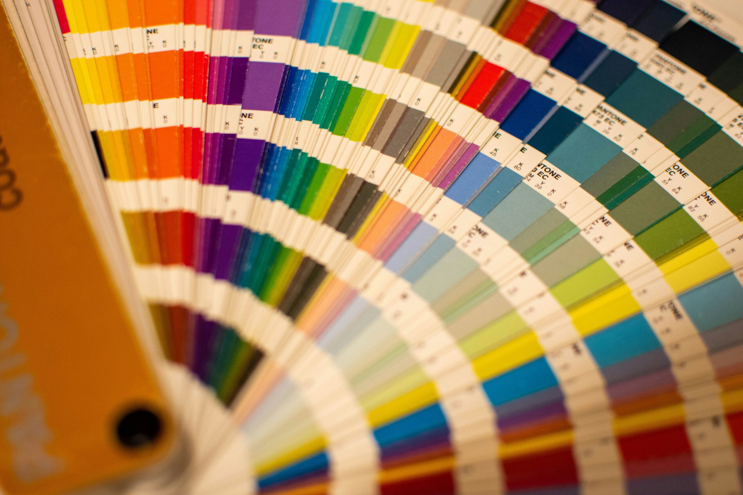
CMYK: The Magic of Mixing Ink
On the flip side, CMYK stands for Cyan, Magenta, Yellow, and Key (Black), and is the colour model used for print. CMYK works on a subtractive principle, which is the complete opposite of the additive nature of RGB. In the world of print, you start with a white page and use ink to subtract light, creating colours by layering cyan, magenta, yellow, and black inks.
Here’s where it gets interesting: CMYK doesn’t produce colours by mixing light; it relies on mixing inks to subtract certain wavelengths of light. When you combine cyan, magenta, and yellow, you can create most of the colours in the print spectrum. However, to achieve true depth, you need black (the ‘K’ in CMYK) because mixing cyan, magenta, and yellow on their own doesn’t produce a deep, rich black. The downside is that CMYK has a narrower colour range compared to RGB, which means some of the bright, bold colours you see on screen can’t be fully replicated in print.
The Bottom Line: Know Your Medium, Know Your Colours
Ultimately, whether you’re using RGB or CMYK, it’s about understanding your medium and how colours will appear. RGB allows for vibrant digital designs, while CMYK ensures colours translate well to print. Like a chef knowing their ingredients, a designer must understand which colour model suits their medium to ensure designs look as intended. So, before starting a project, consider the colours and medium. Knowing the difference between RGB and CMYK is key to creating impactful designs, both online and in print.
RGB allows for vibrant digital designs, while CMYK ensures colours translate well to print.