EmporiDerm is more than an aesthetic and medical practice – it’s a philosophy of self-restoration. When we were brought in to build the brand from the ground up, we knew we wanted to create something that felt timeless, elegant and deeply personal. From the first moodboard to the final logo and brand guidelines, the EmporiDerm identity was designed to reflect beauty that is carefully crafted and confidently owned.
The concept
Inspired by the idea that “people are a lot like clay”, we approached the brand as an artistic narrative. EmporiDerm empowers clients to sculpt and refine their appearance, using subtle, medically backed techniques that restore confidence and youthfulness. The identity needed to be minimal, refined and deeply human – like a modern marble sculpture.
The EmporiDerm brand is a celebration of self, shaped like art and rooted in care.
The process
Creating a lasting impression for your customers often hinges on the details. At Coffee Creative, we understand that the devil is indeed in the details, which is why our turnkey.
01
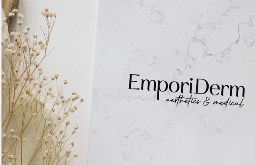
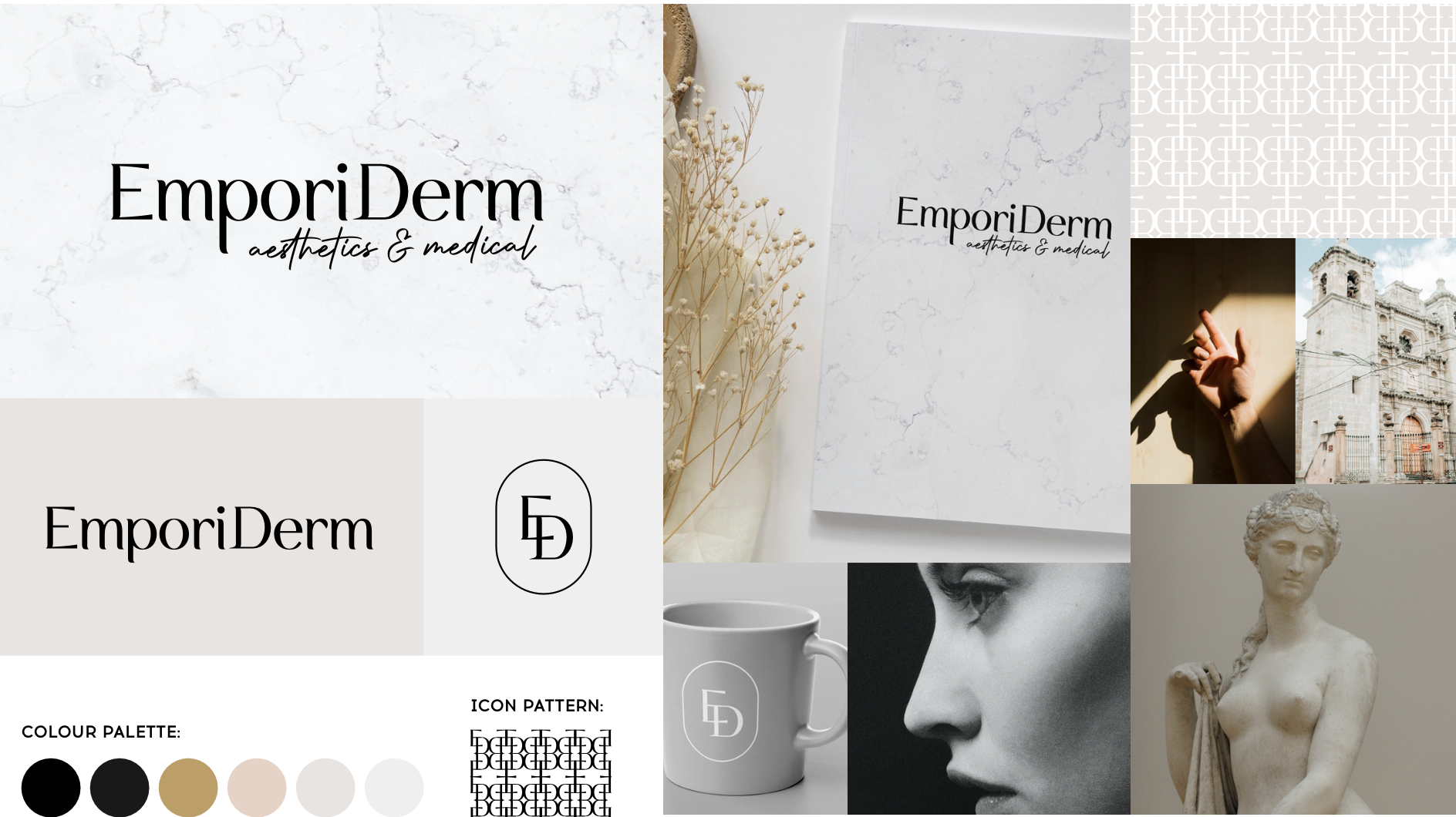
Building the Moodboard
The visual world of EmporiDerm draws inspiration from classic sculpture, natural textures and minimalist design. From smooth marble patterns to soft lighting and neutral tones, the moodboard conveyed an aesthetic of elegance, calm and confidence. We combined imagery of timeless art with intimate, modern photography to anchor the brand in both heritage and humanity.
02
Logo Design with Meaning
The final logo blends structure and softness. The primary wordmark uses a serif typeface with custom details – it’s clean, modern, and quietly sophisticated. The supporting icon features the letters E and D merged in a minimalist oval, reminiscent of an insignia or wax seal. This emblem appears throughout the brand as a stamp of trust, subtly echoing the personalised attention clients receive.
03
CI and Brand Guidelines
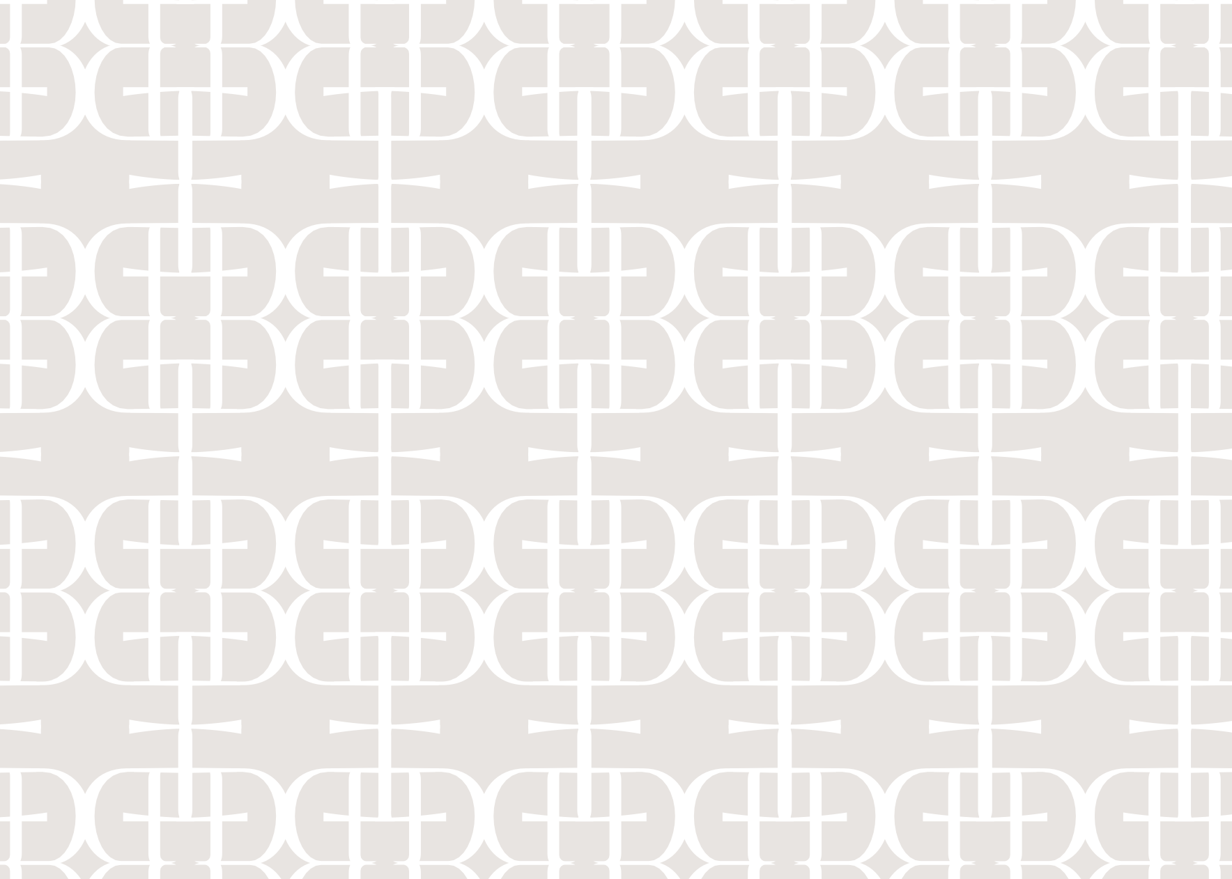
We developed a comprehensive set of brand guidelines including logo use, colour palette, typography, icon patterns and tone. The brand’s icon pattern adds visual texture without overpowering the design, allowing for easy application across packaging, digital platforms, and collateral.
The creative direction
EmporiDerm’s brand direction is rooted in refinement and restraint. It avoids clutter in favour of clarity. We paired rich blacks, creamy neutrals, and subtle gold tones to create a feeling of luxury and softness. The result is a brand that feels both professional and deeply personal – a true extension of the service it represents.
Summary
The EmporiDerm brand speaks softly but leaves a lasting impression. From the first impression of the logo to the elegance of the printed materials, every element was designed to reflect the ethos of sculpting your best self – with confidence, care and creativity.